 FoundLux
Two heatmaps
The market heatmap shows the whole market as tiles. The liquidation heatmap estimates at which price levels leveraged positions would be forcibly closed. Both sit on the right in the terminal, behind the tile icon below the bell.
New positions at 10×, 25×, 50× and 100× leverage create their liquidation levels. Yellow means a lot. Once the price reaches a level, it is gone.
How to open them
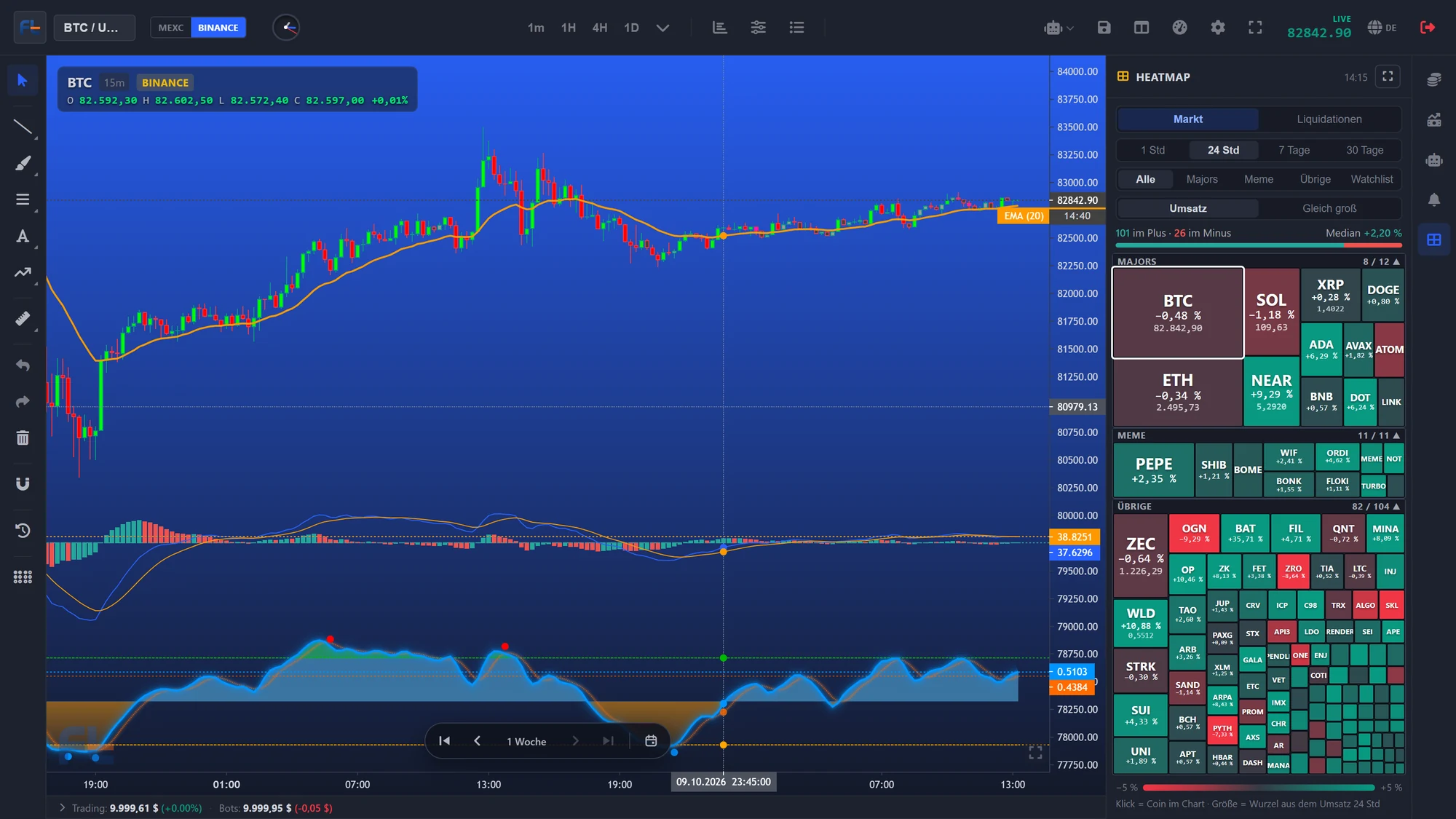
Market heatmap
- All coins in three baskets: Majors, Meme and all others, each basket with its own area
- Size by volume of the last 24 hours in dollars, always from Binance — MEXC counts in contracts, which would not be comparable
- Colour by price change over 1 hour, 24 hours, 7 days or 30 days
- One click brings the coin into the chart; the chart coin's tile ticks in step with the chart
- Discontinued markets drop out by themselves: no volume, no tile
Where liquidations might be waiting ESTIMATE
No exchange publishes where its traders' liquidation prices are. The map is therefore an estimate, as it is at Coinglass — calculated from data anyone can see.
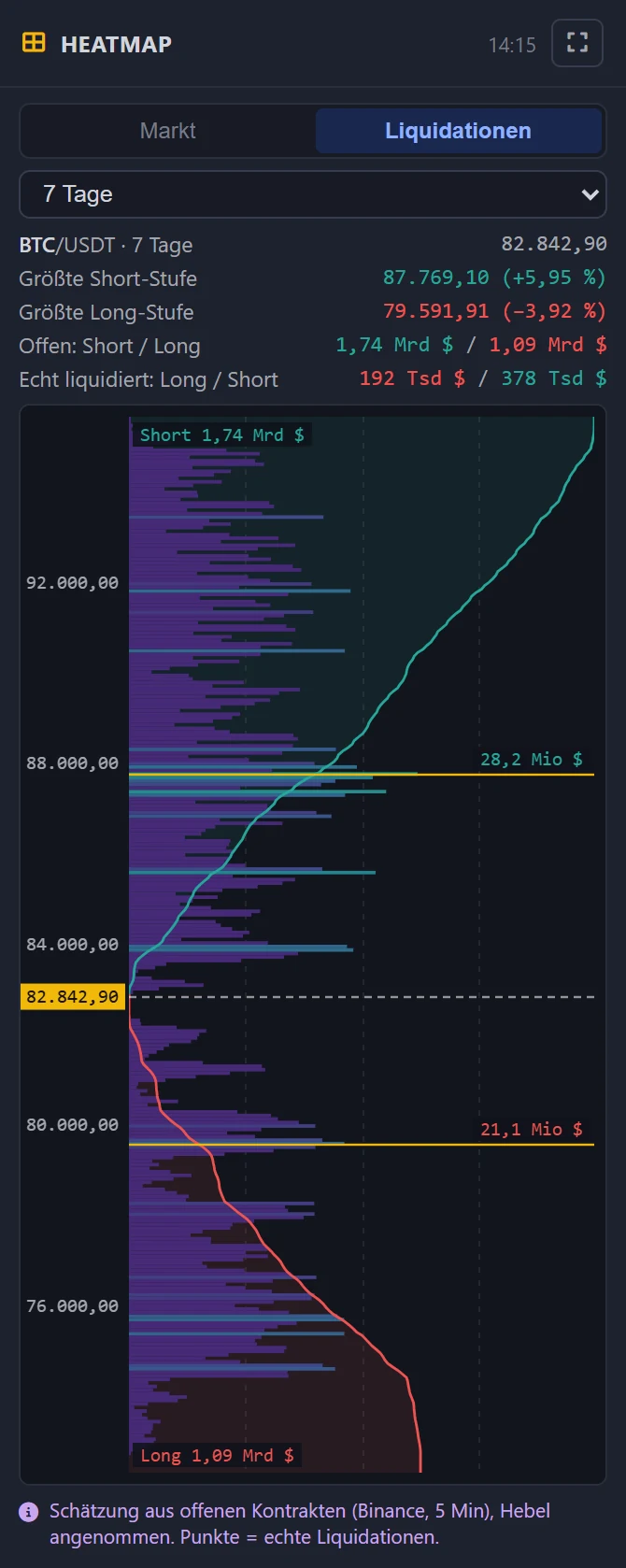
How it is estimated
- Every five minutes the server fetches open interest and the ratio of buying to selling from Binance.
- If open interest rises, positions were added. They are spread across the candle, between low and high; the share of longs follows the buying share.
- Each new position gets a typical leverage: 10× at 30 %, 25× at 30 %, 50× at 25 %, 100× at 15 %. This gives its liquidation price.
- If open interest falls, positions were closed — all levels shrink proportionally.
- Once the price reaches a level, it is triggered and disappears from the map.
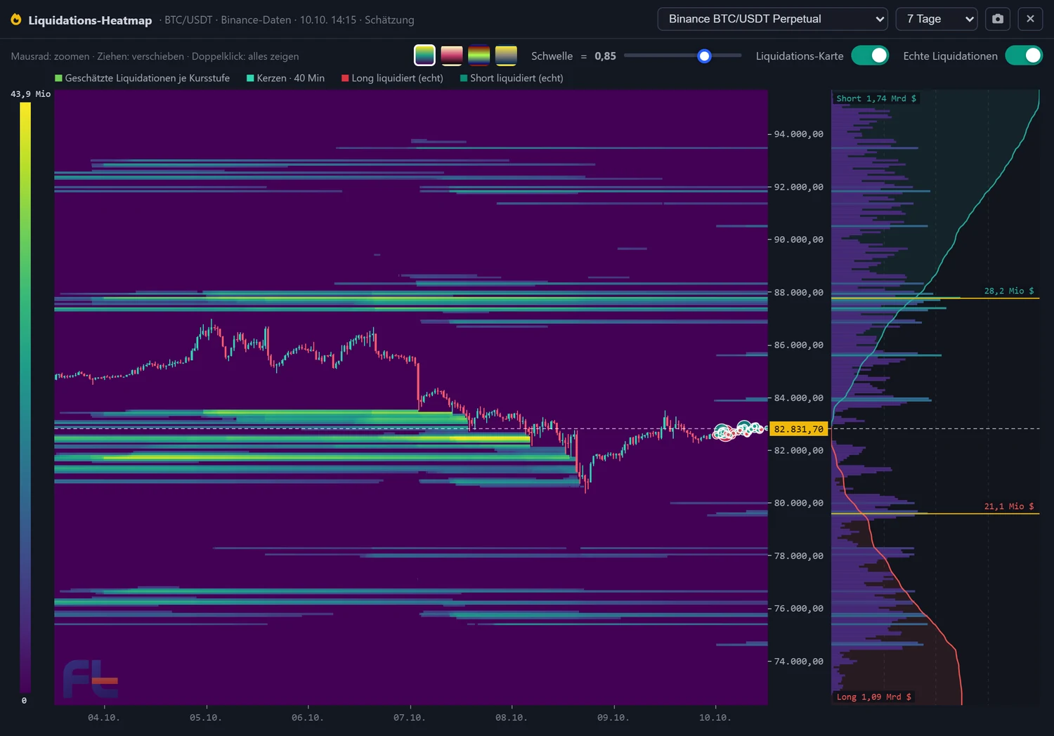
On top are the real liquidations reported by Binance, shown as dots. Binance reports at most one liquidation per coin per second — so the dots are a lower bound.
Controls
| What | How |
|---|---|
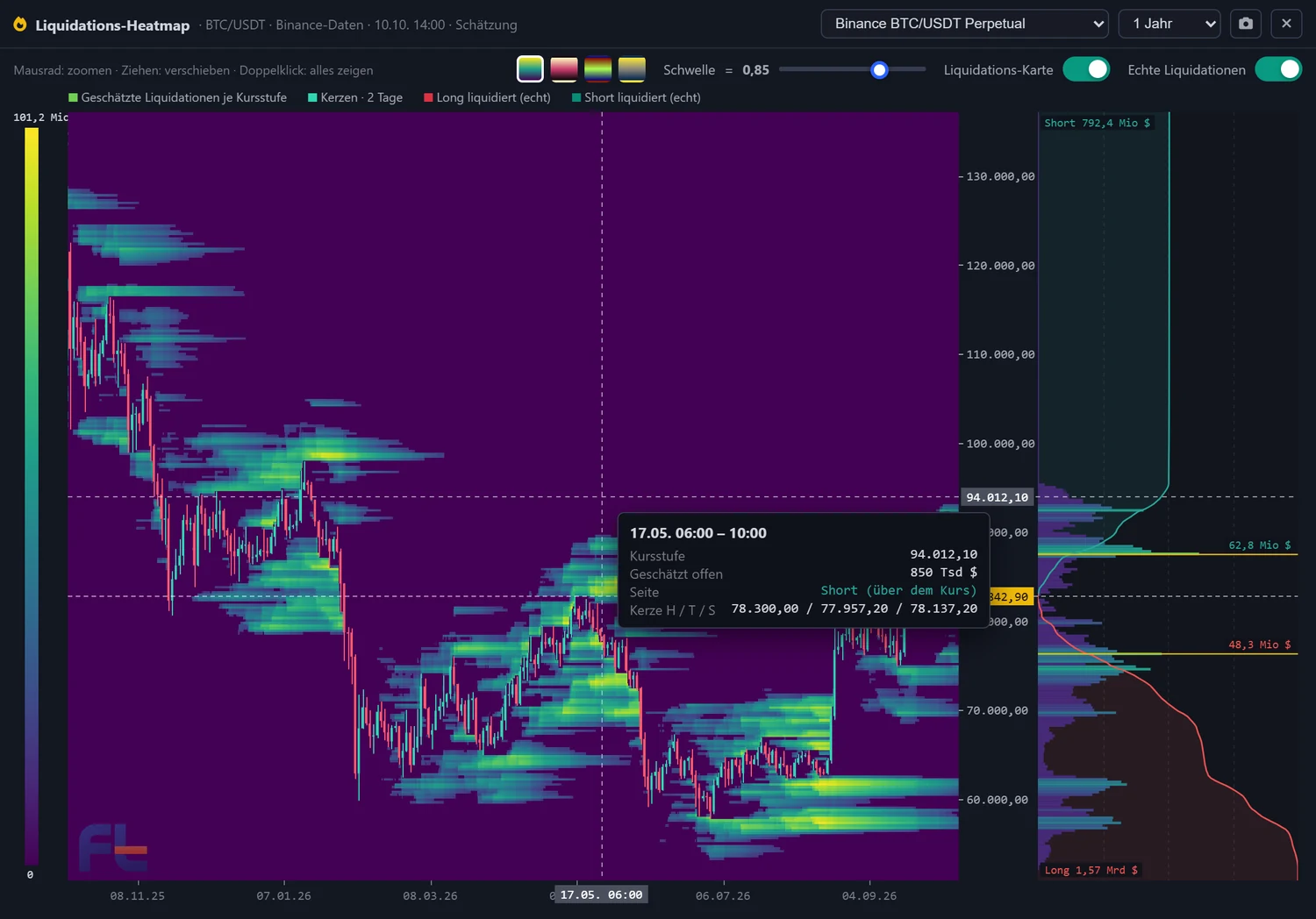
| Period | 12 hours to 2 years. Short periods in 5-minute steps, 2 years in 8-hour steps |
| Threshold | Slider: whatever lies below it stays background — so the dense zones stand out |
| Colours | Four colour scales to choose from |
| Zoom | Mouse wheel on the map: time; on the price scale: price. Drag to pan, double-click shows everything |
| Crosshair | Price level, estimated amount and side at every point |
| Live | Running candle and price line in step with the chart |
How good is the estimate?
We compared it with real liquidations from OKX, candle by candle over one day, and asked: does the estimate say more about when and on which side liquidations happen than the price movement alone? The rule was fixed before the run.
| Coin | Real liquidations | Contribution of the estimate |
|---|---|---|
| BTC | 1,147 · $11.8M | 0,68 |
| ETH | 1,006 · $9.2M | 0,57 |
| SOL | 456 · $4.0M | 0,73 |
| XRP | 148 · $0.5M | 0,70 |
| DOGE | 121 · $0.3M | 0,50 |
Contribution = rank correlation with the real liquidations after the share of the price movement has been removed. From 0.10 it counts as holding up — all five coins are clearly above that.
Briefly answered
Why Binance data, even if I trade on MEXC?
Why is a long period missing for some coins?
Can I trade on it?
See for yourself
Create an account, open the tile icon below the bell on the right. No real money, no payment details.